Walls: A global brand identity evolution
Brand strategy · Visual identity · Art direction · Design systems · Global brand guardianship
The challenge
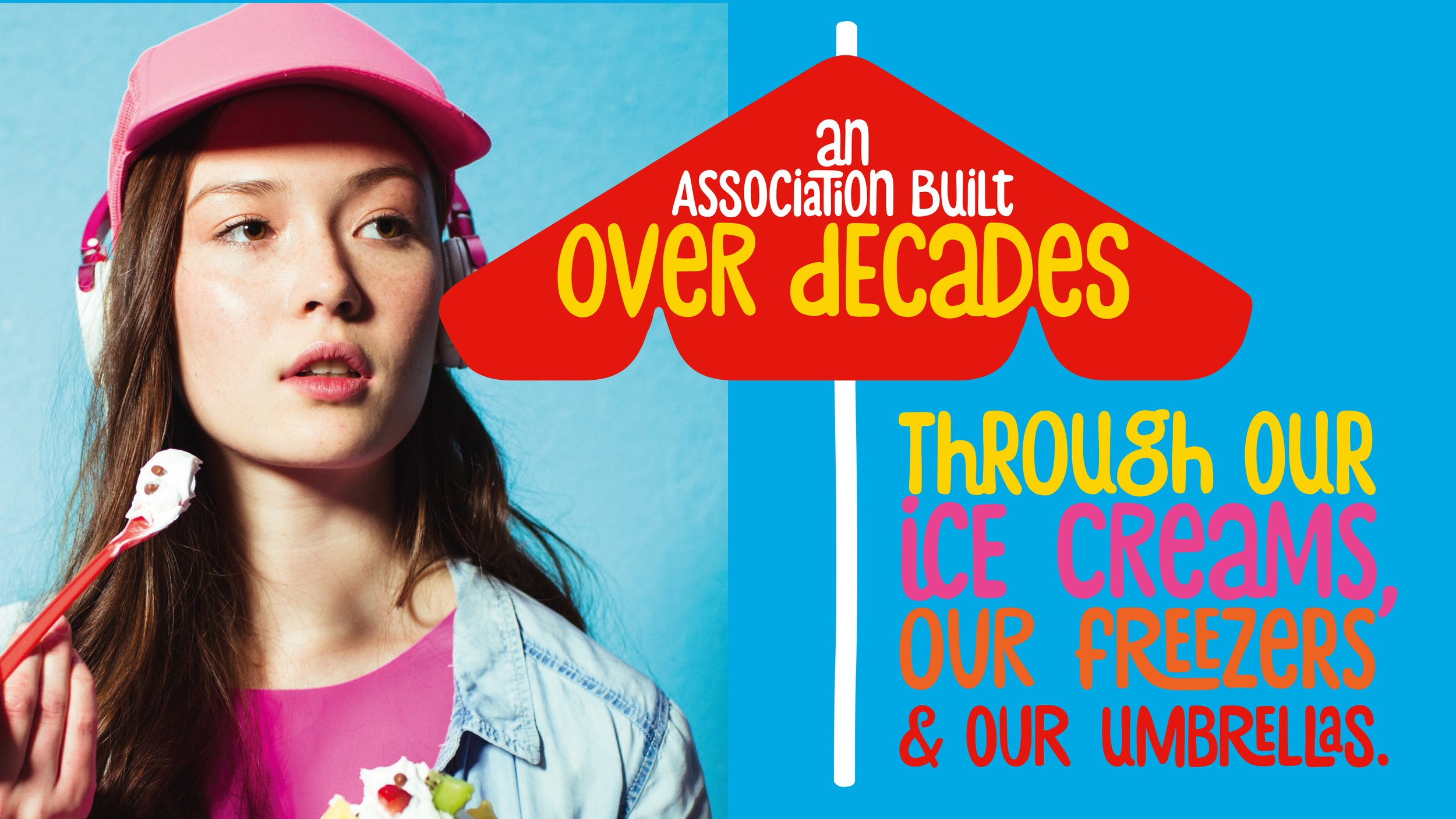
Wall’s had built an association with happiness through its ice creams, but as the brand evolved, its visual identity had become increasingly reliant on multiple different graphic devices which were different in each market and inconsistent across an enormous volume of global creative assets. The challenge was to create a simpler, more distinctive and consistent brand identity — one that could work harder across every touchpoint.
The opportunity was already there. Wall’s had an iconic asset with the potential to do more.
The insight
The heart was the brand.
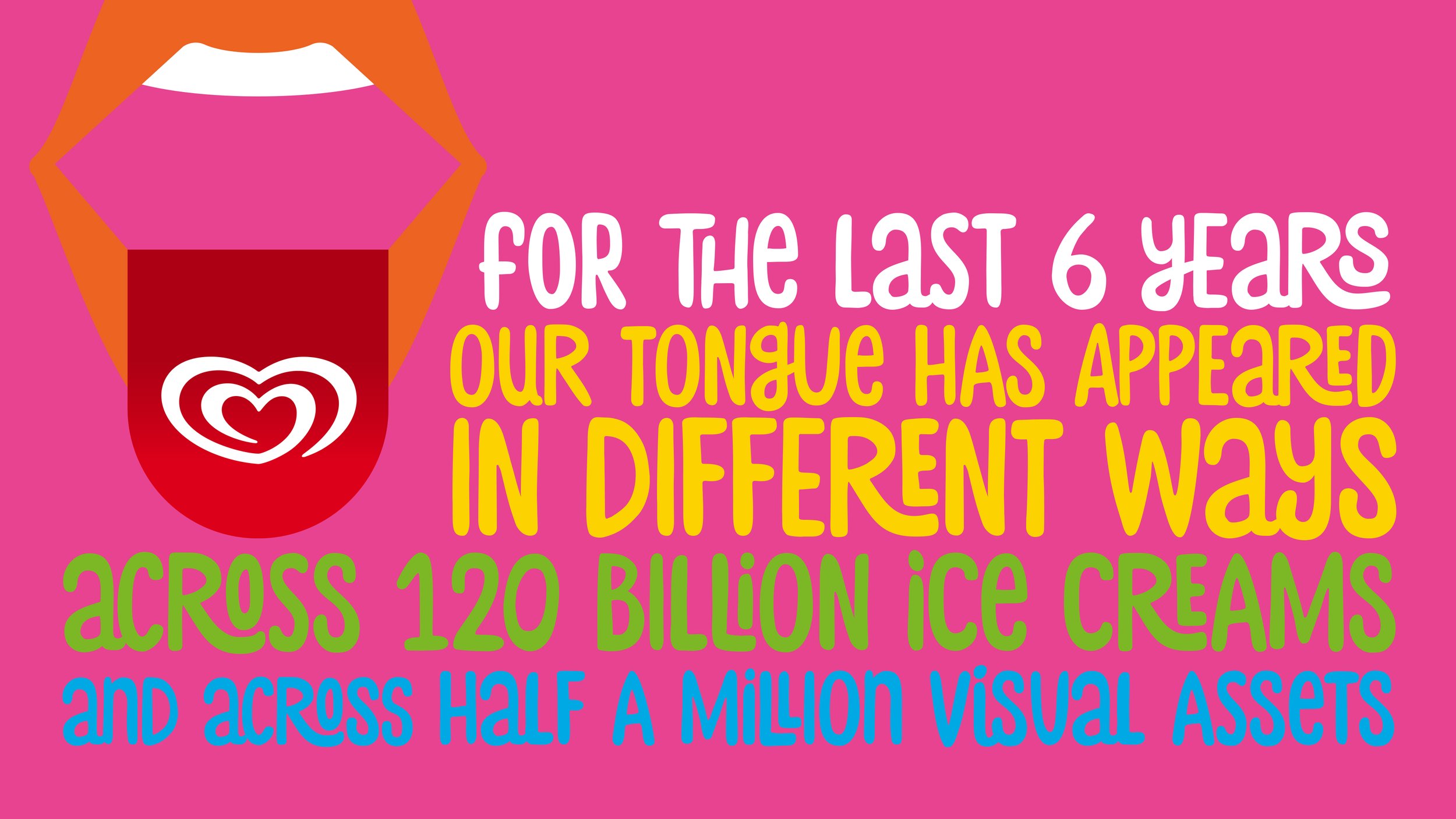
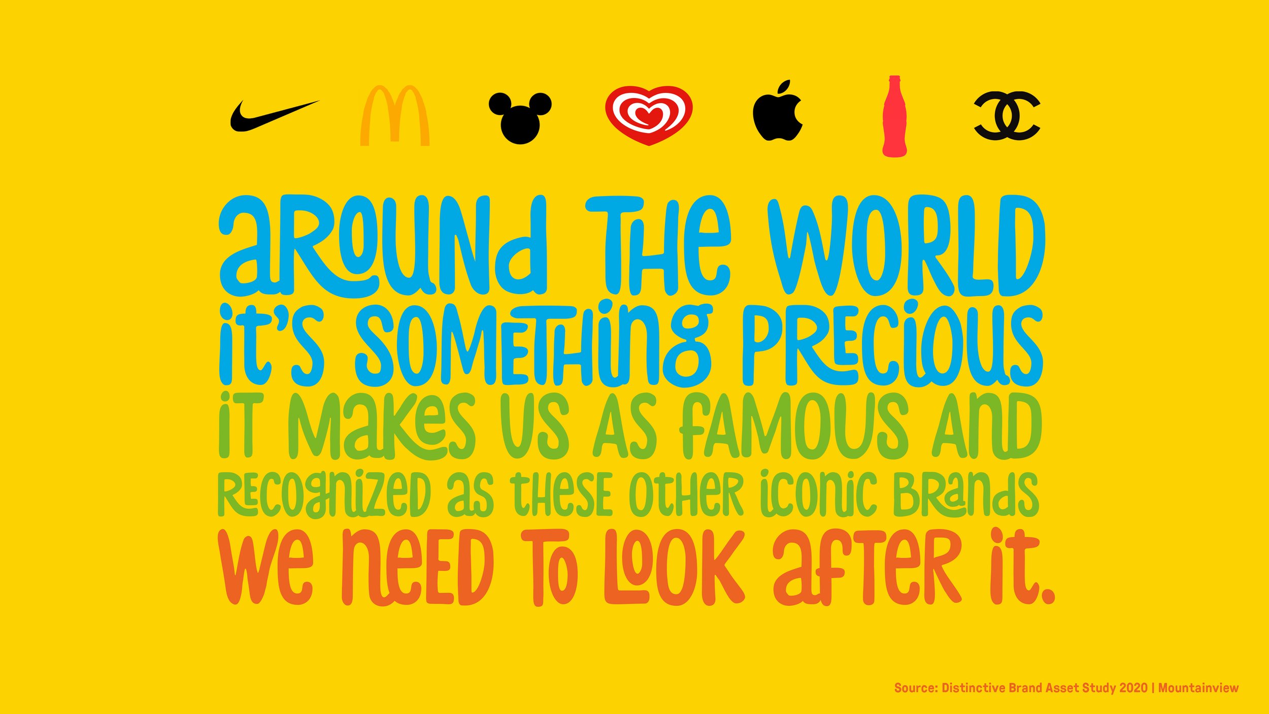
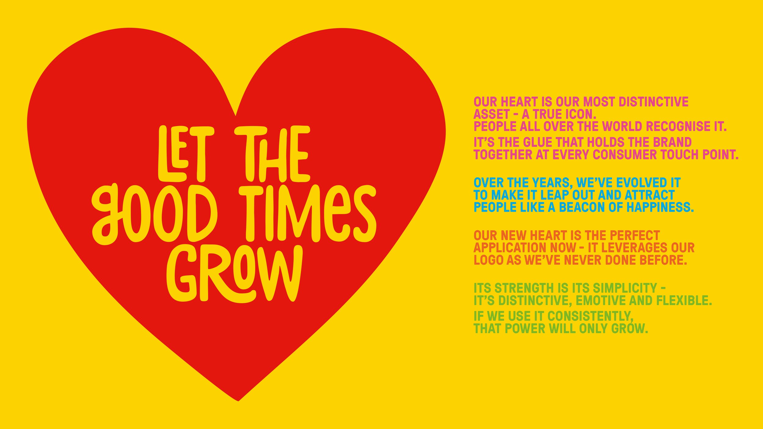
The heart was our most distinctive brand asset, with brand identification research supporting its strength across markets. The tongue, by contrast, was not as widely recognised.
Rather than creating something new, the opportunity was to focus on what people already knew and loved.
A simpler identity. A stronger association. One unmistakable symbol of happiness and togetherness.

The idea
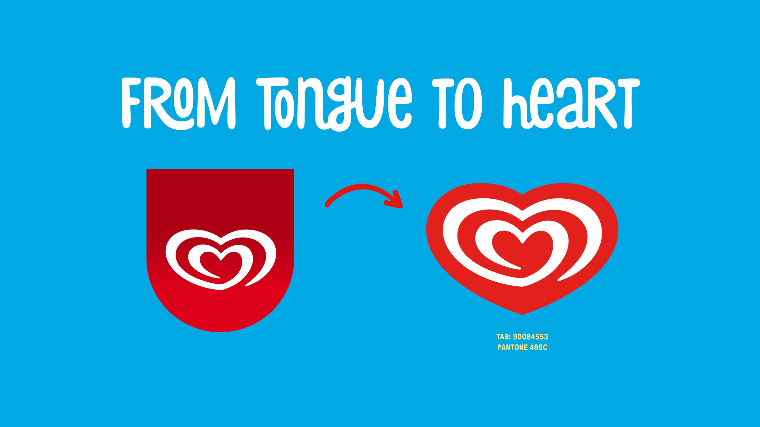
Goodbye tongue. Hello heart.
The rebrand centred on a deceptively simple decision: make the Wall’s heart the hero.
By removing the tongue and placing the heart at the centre of the identity, the brand could move towards a more confident, recognisable and flexible visual system. The heart became more than a logo; it became the unifying element connecting the brand across markets, communications and consumer experiences.
The ambition was to build greater recognition through simplicity, while giving the identity the freedom to express the joy, warmth and personality of Wall’s.
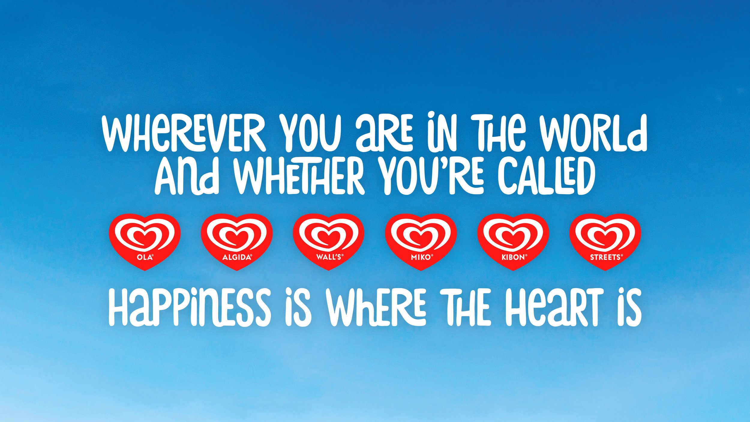
The iconic logo is easily identified and a symbol of the joy and happiness that ice cream brings.

The design approach: Create guidelines
01 — Simplify the identity
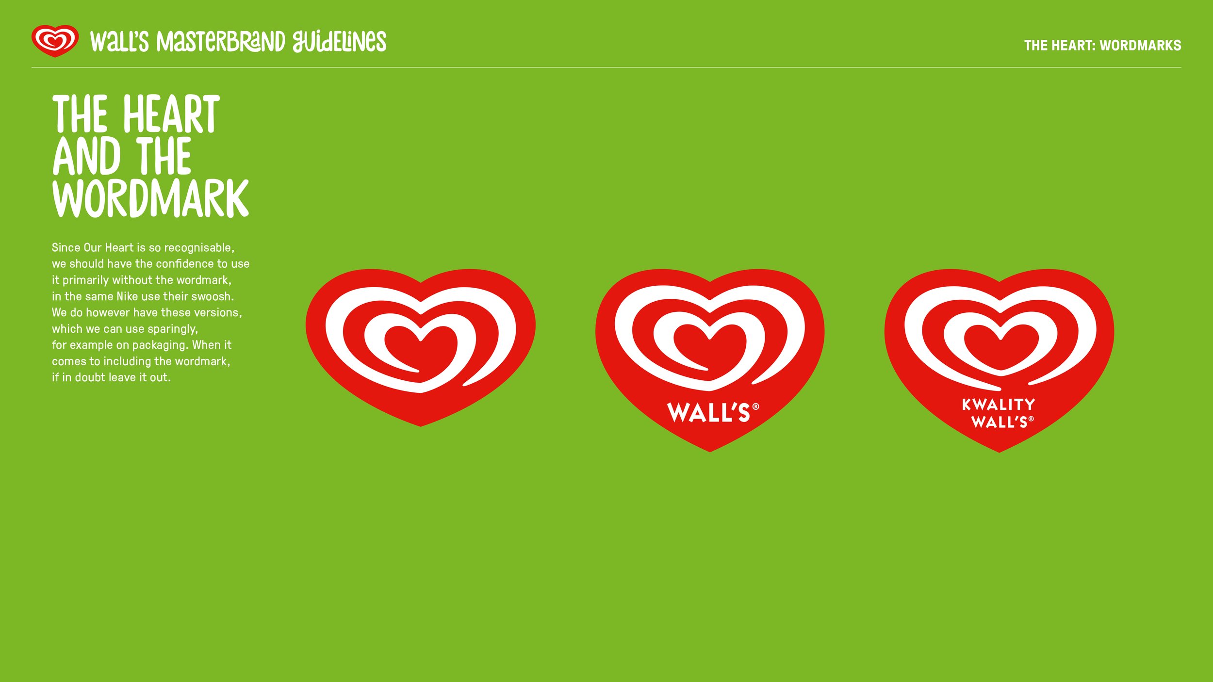
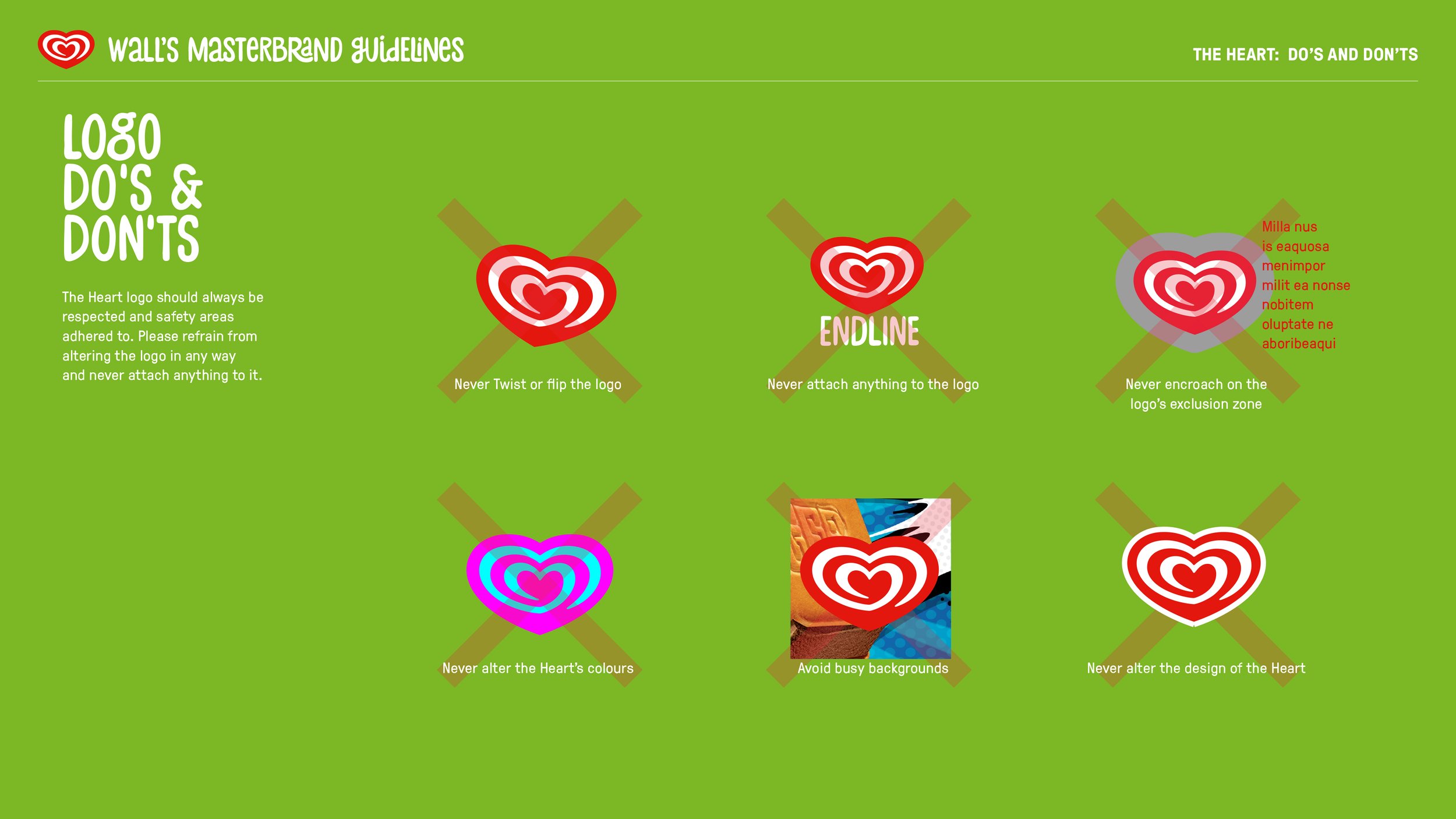
Put the heart front and centre, allowing its distinctive shape to work independently of the wordmark wherever appropriate. A confident, uncomplicated identity designed to be recognised at a glance.
02 — Build a world of colour
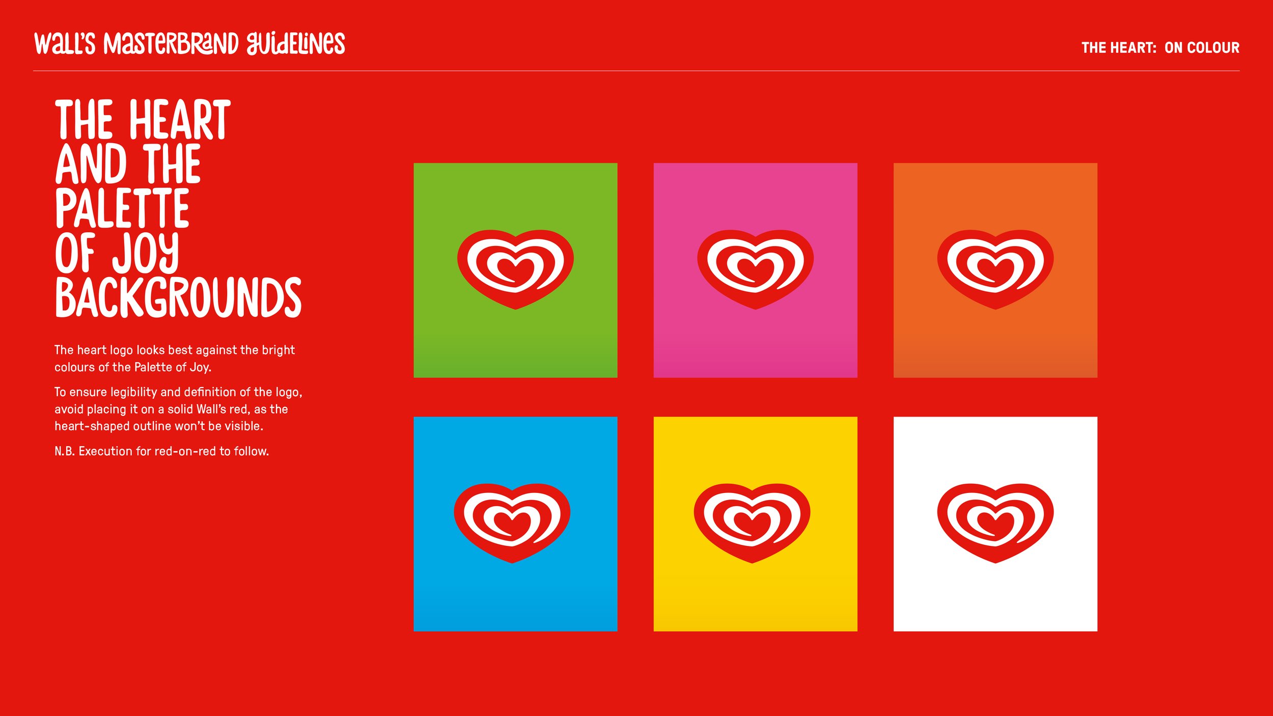
Develop a vibrant Palette of Joy, led by Wall’s signature red and supported by bright, energetic secondary colours. Together, the palette created a distinctive brand world that felt sunny, friendly and full of optimism.
03 — Give the brand a voice
Introduce Stick-A-Round typography for expressive, characterful headlines, complemented by GT Pressura for longer-form copy. The combination balanced playful irreverence with clarity and structure.
04 — Create a consistent system
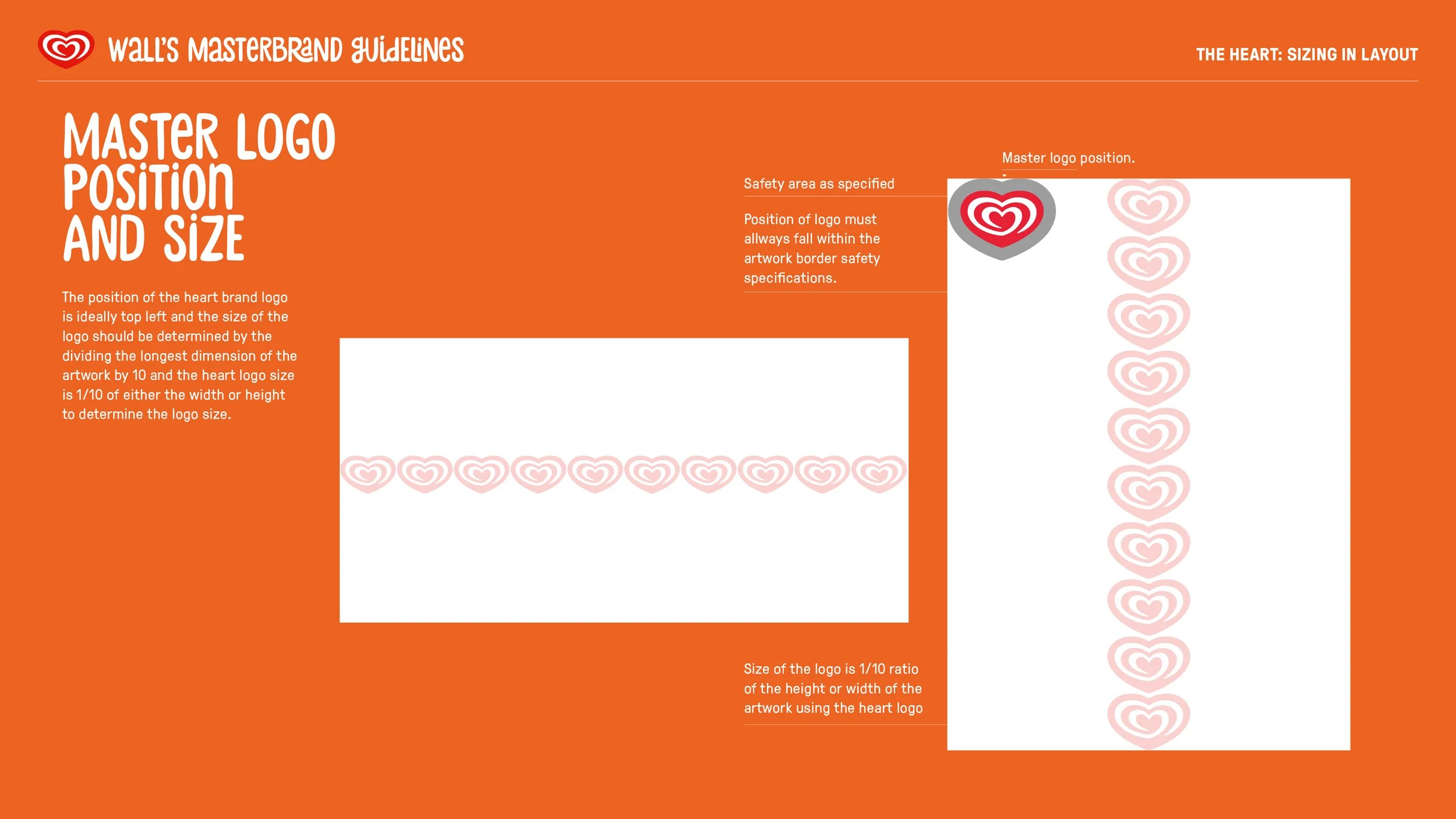
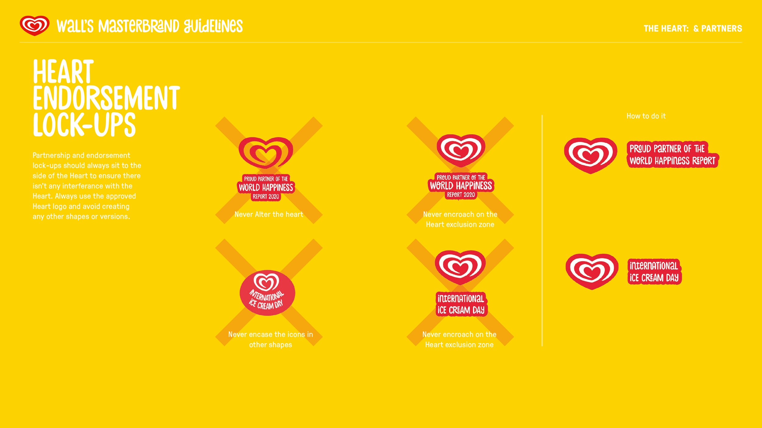
Establish clear principles for logo sizing, positioning, exclusion zones, colour application, photography and layout. These guidelines gave creative teams a shared framework for delivering work that felt unmistakably Wall’s, regardless of format or market.
One heart. Every touchpoint.
The identity system was designed to work across the breadth of Wall’s global communications, from advertising and packaging to point of sale, social media and television commercials.
Rather than treating each application as a separate design challenge, the guidelines established a common visual language. Consistent use of the heart, colour, typography and imagery would help strengthen recognition wherever consumers encountered the brand.
The result was a system built to balance global consistency with the flexibility needed to work across different markets, products and cultural contexts.